A Redesign of U of I’s Online Learning Experience
As a remote student, my main point of contact for all classes is BBLearn, VandalWeb, Outlook, and the other online apps required for my classes. Keeping up with the class requirements and managing them through these applications proved daunting. This personal challenge became the springboard for my final project in PSYC 561 - Human-Computer Interaction.
To create a seamless online experience for University of Idaho students, I employed various research methods to gain a deeper understanding of the challenges.
Research
Understand U of I student statistics
By researching the school's profile through the website and the Internet, I’ve learned that UI students come from all 50 states and 73 countries, including the District of Columbia, American Samoa, Puerto Rico, and the Virgin Islands. All students would have had to interact with all the web-based applications throughout the school year.
UIdaho statistics from 2021
Direct, indirect competitors, and influencers
To get a better understanding of the competitive landscape. I’ve also done some research on the experiences provided by BBLearn competitors such as Canvas (which we currently use now), Brightspace, Moodle, EdX, and Coursera. This exercise helped me identify trends and best practices in the online learning and digital education industry. Competitive studies have helped me understand features and functionalities users have come to expect and, most importantly, learn about gaps and opportunities for a better UX.
Interviews
Understanding user needs and pain points was crucial for gaining insights into the online experience at U of I, particularly BBLearn's user experience. I mainly listened in during classes for student feedback and conducted interview sessions before finalizing the design solutions.
Through the research process, two key pain points emerged:
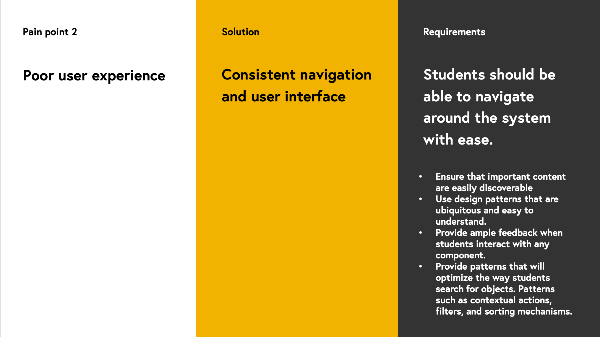
Poor User Experience. (BBLearn) Students find BBLearn cumbersome to use. For example, some struggle to navigate the system and find information quickly, requiring multiple clicks to reach desired pages. Additionally, concerns arise regarding the timed exam experience.
Too Many Apps and Sites. The volume of applications and websites with varying user experiences creates a challenge for students.
As an example of the first pain point, I compiled a list of applications students interact with throughout the semester. Although app usage volume may vary, students typically interact with at least three applications per class.
A compilation of applications used by students.
To paint a picture of a typically scenario, below is example of the different stages and the number of applications a student might interact with to prepare for an exam.
Learning about the exam guide and instructor notes can involve interacting with multiple applications. Students may need to access BBLearn, Outlook, and a PDF file. Additionally, reviewing video recordings depends on the professor's preference. They may require students to bookmark Microsoft Stream, access Slack, or use Microsoft PowerPoint for the presentation copy to take notes. This need to locate and interact with various applications can be cumbersome and time-consuming.
Research and Synthesis
From my research, I’ve learned the different archetypes of users interacting with BBLearn and all the other web-based applications. For example, when it comes to types of learning, one extreme would be students who are off-campus online and rely on online applications to take classes; on the other end, there are on-campus in-person students.
Mapping of user archetypes and extremes
User personas capturing key archetype characteristics
Understanding the user archetypes and personas was crucial to empathizing with and stepping into the shoes of real users. These artifacts were valuable anchors during the design discovery and iteration phase.
Design Goals
I have devised the pain point, solution, and requirements framework as aasimple guide to test out design hypothesis “solutions” while keeping the focus on the user needs.
Design Exploration and Iterations
During the design phase, I completed two rounds of explorations and iterations using low-fidelity mocks followed by high-fidelity mocks.
To view more design iterations, open the presentation.
